Letters First: How Three Sister Stores Turn Type Into the Artwork
Some designs lead with a picture. Others lead with the letters: a name, a title or one short line, set so carefully that the type becomes the whole piece. This store has a few of those, from the quiet light-grey COCODRILLO wordmark to the heavy black block lockup for Johann Sebastian Bachlava the Doctor. Three sister stores take lettering in very different directions, and putting them side by side shows how much a typeface can say on its own. Here is what each one does, what to look for in the artwork, and how a type-led piece wears.
Why do lettering-led designs work so well?
A word reads from across a room in a way a detailed picture often does not. It also tends to sit easily with the rest of an outfit, because there is less colour and less detail competing for attention. The mood comes from the letters themselves, and three things set it:
- Weight. Heavy block letters feel loud and direct; thin serifs feel calmer and more formal.
- Edges. Pixel steps feel playful and digital, a wobbly marker line feels hand-made, a clean outline feels sharp.
- What sits around the word. A few stars, a stripe of colour or a small crest can change the whole tone without taking over.
Keep those three in mind and each of the stores below starts to make sense.
ILLIT: pixel-edged letters with a pop shine
ILLIT is a K-pop girl group from Seoul on Belift Lab, a HYBE sub-label, with five members: Yunah, Minju, Moka, Wonhee and Iroha. The group debuted on 25 March 2024 with the EP Super Real Me, and its lead single, Magnetic, reached No. 91 on the Billboard Hot 100 and topped Korea's Circle Digital Chart.
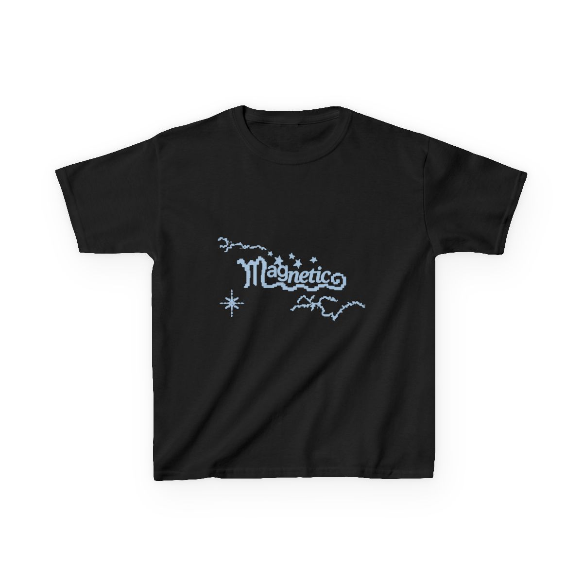
That single gives the ILLIT store its signature lettering. Magnetic is set in chunky, pixel-edged capitals, so every curve is built from small steps, which makes it look like a word from a game screen. One version keeps the letters grey with a little cluster of stars and a bright red strawberry in the top corner. The other, the sky-blue Magnetic Sparkle tee, turns the same letters a soft blue and adds a trail of stars, an eight-point sparkle at the lower left and a loose pixel squiggle across the corners. It is the calm, airy take on the design.
For contrast, the store's Book Fantasy design goes retro: golden yellow script with a deep blue shadow, wrapped in looping oval lines, with a small Climax Books line tucked under the F. It has the look of an old paperback cover, a warm vintage note next to the pastel designs.
Dinosaur Jr: a wordmark drawn by hand
Dinosaur Jr is an American rock band from Amherst, Massachusetts, formed in 1984 by J Mascis, Lou Barlow and Murph. The band began as Dinosaur; in 1987, after the album You're Living All Over Me, a group called Dinosaurs sued over the name, and Jr. was added. The band split in 1997, and the same three reunited in April 2005.
The lettering on the Dinosaur Jr designs is the opposite of polished. The wordmark is thick, wobbly, all-caps DINOSAUR with a lowercase Jr, drawn in marker and tilted slightly upward to the right. It appears in many colours across the range: purple under a painted cleaver figure, bright green over a pink-coated horned figure, maroon beneath a shaggy moss giant.
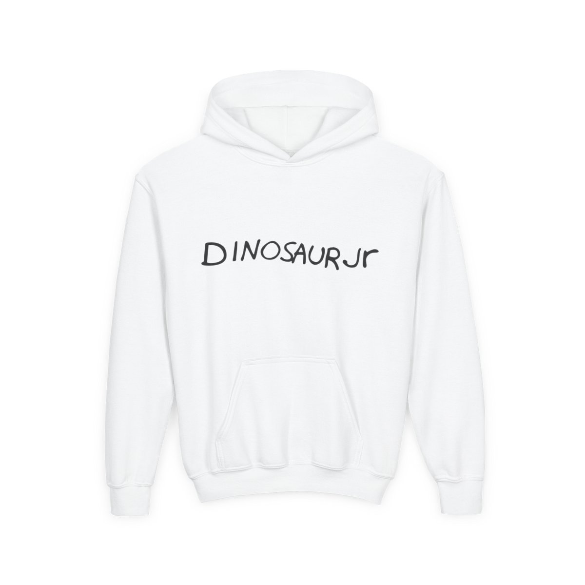
The purest version is the Marker Wordmark hoodie. The front is nothing but the black wordmark. Turn it around and the back carries the wordmark again over a high-contrast blue-and-black portrait of a long-haired woman, so the plain front hides a surprise.
The Magenta Sweep It Into Space design works the same way: a plain magenta wordmark on the front, and on the back the painted two-eyed creature from the band's 2021 album Sweep It Into Space, with the title in light green handwriting. For a piece of the band's history, the You're Living All Over Me design letters that 1987 album title in the corner of a charcoal drawing in a lime-green frame.
Ryan Garcia: block type and fight-poster slogans
Ryan Garcia is an American professional boxer from Victorville, California, now living in Los Angeles. On 2 January 2021 he won the WBC interim lightweight title by stopping Luke Campbell in the seventh round.
His designs use lettering the way a fight poster does: big, heavy and built to be read at a glance. Free The Children is the clearest example. FREE is set in heavy black block letters, and THE CHILDREN sits under it in a tall, thin serif that runs the full width. Two typefaces, one message and no decoration; the contrast between the heavy and the delicate letters does all the work.
Shock The World Lion Crest is more of a badge. The name runs in wide black serif letters, a thin green, white and red stripe sits beneath it, and a crowned lion inside a heart closes the layout. On the back of another piece, Rematch Me fills the whole space with tall block letters that fade from dark grey to white and back. You can see how far the same idea stretches across the full Ryan Garcia range, from the bold slogans to the light white-art designs made for darker garments.
How do you wear a type-led piece?
A few simple rules carry across all three stores, and across the lettering designs here too:
- Let the word be the loud part. A big block slogan like Free The Children or the Bachlava lockup looks best with plain trousers and a plain jacket, so nothing fights the type.
- Use the front-and-back split. Designs like the Marker Wordmark and Magenta Sweep It Into Space keep the front simple and put the colour on the back, which suits days when you want to look quiet from the front.
- Match the edges to the mood. Pixel letters and pastel blue feel light and casual; marker lettering feels relaxed and a little scruffy; heavy serifs and block type feel sharp and direct.
- Pair across stores by weight. Heavy black type sits well with heavy black type: the Johann Sebastian Bachlava the Doctor lockup and Free The Children make an easy pair. A soft wordmark like COCODRILLO goes well beside the sky-blue Magnetic letters.
All three sister stores carry their designs on kids heavy cotton tees, so the lettering works for younger wearers as well; check each product page's size chart before choosing a size.
Lettering is the simplest kind of design, and that is why it shows so clearly what a brand sounds like: pop shine for ILLIT, hand-drawn noise for Dinosaur Jr, poster punch for Ryan Garcia, and here, food-show lockups and album titles set in bold type.